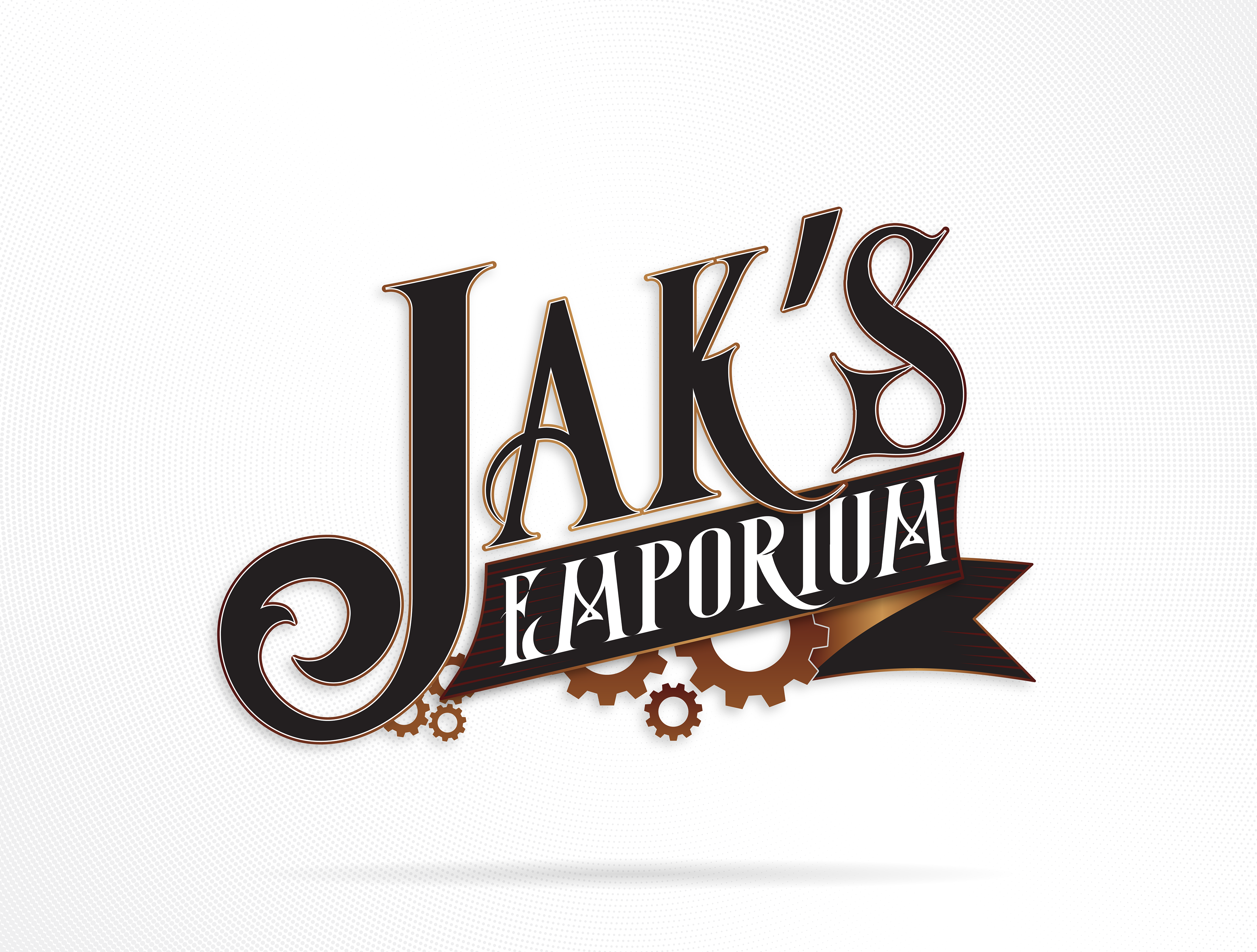
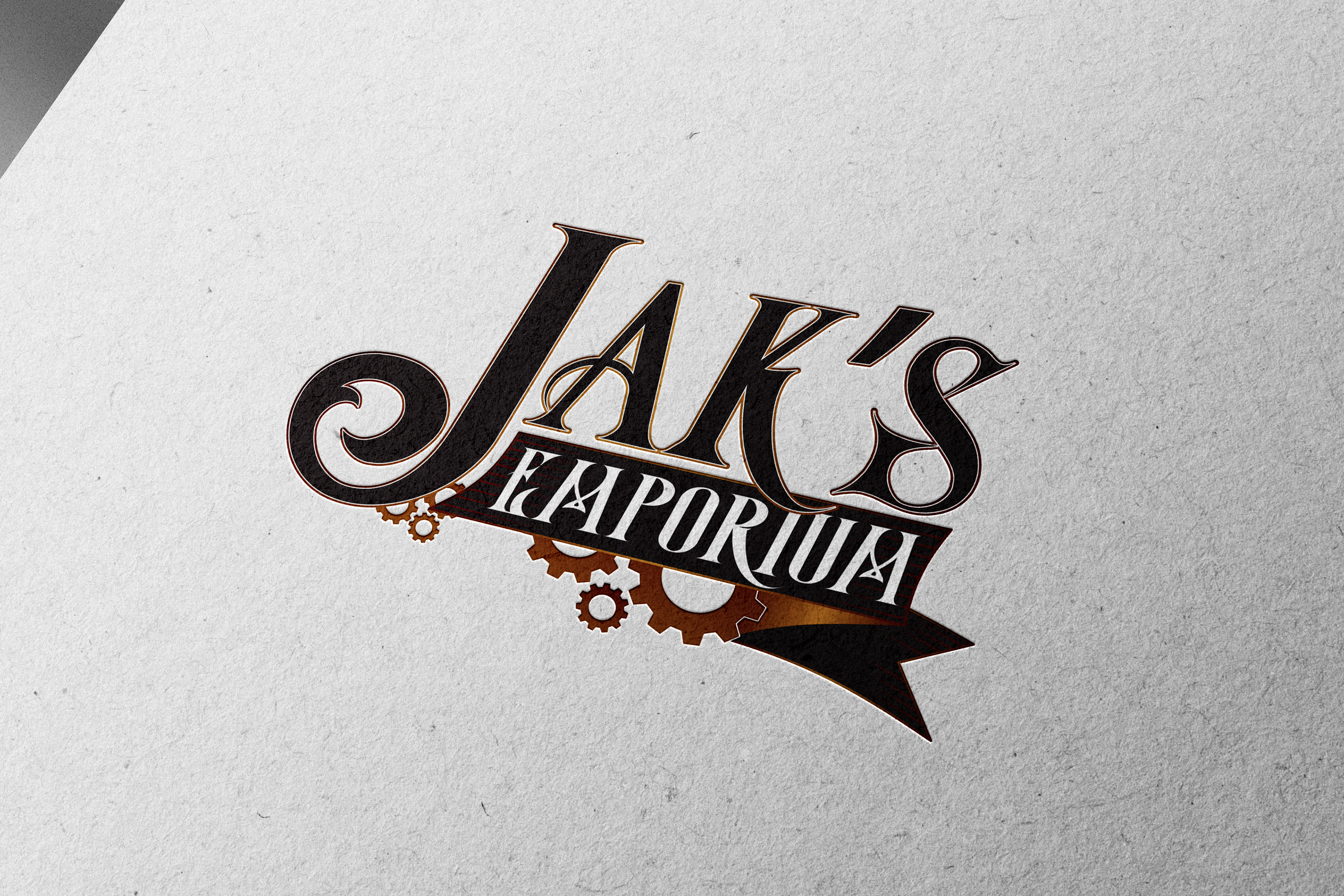
JAK’s Emporium was created as the overarching brand for my Previous Shopify store and now one of my current Etsy Stores, serving as a central marketplace for the many different projects, brands, and designs I’ve developed over the years. I spent quite a bit of time exploring names — it originally began under From the Mind of JAK, then briefly operated as Project Master Quest. Ultimately, I landed on JAK’s Emporium because it captured the eclectic, exploratory nature of what I wanted the store to be: a collection of curiosities and creations.
The term Emporium carries an old-world charm that felt fitting for a shop filled with imaginative works. For the logo, I wanted to reflect that whimsical yet mechanical spirit, drawing inspiration from steampunk aesthetics and antique toy craftsmanship. The design combines elegant, Victorian-style typography with gears and metallic flourishes, symbolizing the creative machinery behind all the art and design I produce.
This project also became an opportunity to push my technical limits in Adobe Illustrator, experimenting heavily with layered effects, gradients, bevels, and depth to give the logo a tangible, polished finish. The end result blends artistry and engineering, a perfect metaphor for how I approach design as both a craft and a science.
Reflection:
JAK’s Emporium represents both a brand and a mindset, a space for experimentation, learning, and uniting my creative worlds under one cohesive identity. The steampunk style felt like a natural fit for my love of detail, invention, and storytelling. This logo stands as a milestone of my growth as a designer, showing just how far my craft has evolved since my earliest branding experiments.
JAK’s Emporium represents both a brand and a mindset, a space for experimentation, learning, and uniting my creative worlds under one cohesive identity. The steampunk style felt like a natural fit for my love of detail, invention, and storytelling. This logo stands as a milestone of my growth as a designer, showing just how far my craft has evolved since my earliest branding experiments.
Tools: Adobe Illustrator | Adobe Photoshop