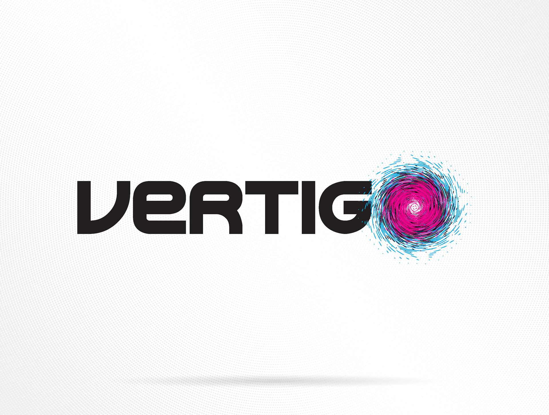
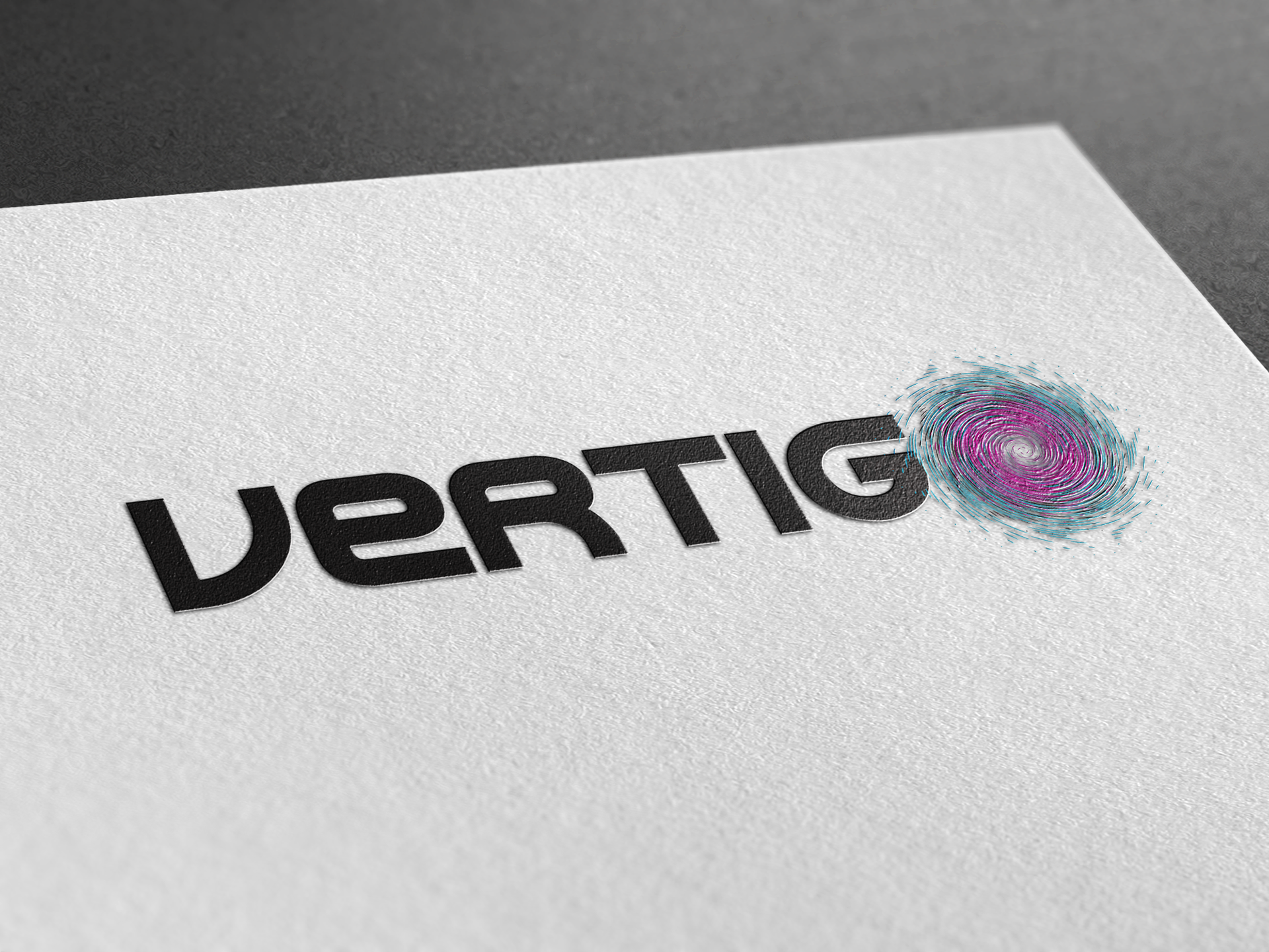
Vertigo was an ambitious business venture I started with friends, envisioned as a branding and consulting agency focused on helping clients build strong visual identities and connect with audiences through social media and digital channels. The name Vertigo represented both the dizzying pace of the creative industry and the energy that comes with navigating it.
The logo captures that essence, sleek, grounded typography anchored by a swirling vortex that replaces the “O.” The spiral symbolizes motion, creativity, and transformation, while also referencing the literal sensation of vertigo, that disorienting, yet exhilarating, spin of ideas and opportunity. The blend of cyan and magenta adds vibrancy and contrast, hinting at both digital media and the CMYK printing spectrum.
Although the business only completed one client project before disbanding, it was a valuable hands-on experience in client relations, branding systems, and contract work, lessons that carried forward into later professional projects.
Reflection:
This project served as my first real introduction to creative entrepreneurship, learning not just how to make great design, but how to manage relationships, expectations, and execution in a collaborative setting. The Vertigo identity remains a reminder that every creative journey involves a little spin before you find your balance.
This project served as my first real introduction to creative entrepreneurship, learning not just how to make great design, but how to manage relationships, expectations, and execution in a collaborative setting. The Vertigo identity remains a reminder that every creative journey involves a little spin before you find your balance.
Tools: Adobe Illustrator | Adobe Indesign