Logo
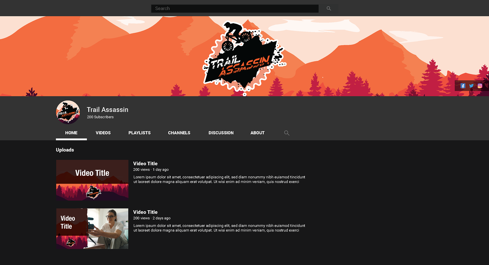
YouTube Channel Graphics
Video Intro
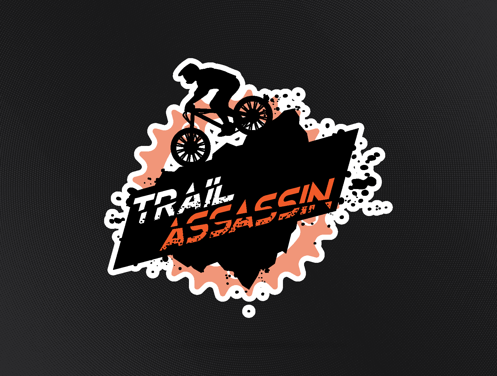
After creating branding for my niece and nephew’s channels, my brother-in-law reached out to see if I could design something for his mountain biking channel, Trail Assassin. The name alone had a lot of strong visual energy behind it, so I wanted to build a design that felt fast, aggressive, and full of motion, something that would reflect both his passion for riding and the rugged nature of the sport.
The logo began as two distinct elements: the text treatment (with the sliced “Assassin” lettering symbolizing precision and speed) and the biker silhouette. Once those were developed, I experimented with composition until they merged seamlessly. To pull the design together and balance the negative space, I introduced a gear shape and paint-splatter elements, evoking dirt, movement, and the chaos of the trail.
The final look combines sharp angular typography with organic splatter forms, creating a strong visual contrast that gives the brand its punch. The orange and black palette amplifies the sense of energy and danger while keeping the identity clean and adaptable for thumbnails, banners, and stickers.
Reflection:
This was a fun project that pushed me to think about motion and balance within a static logo. It was also a great exercise in composition, finding harmony between mechanical precision (the gear) and organic flow (the splatter). The final result feels fast, bold, and unapologetically intense, exactly what a brand named Trail Assassin should be.
This was a fun project that pushed me to think about motion and balance within a static logo. It was also a great exercise in composition, finding harmony between mechanical precision (the gear) and organic flow (the splatter). The final result feels fast, bold, and unapologetically intense, exactly what a brand named Trail Assassin should be.
Tools: Adobe Illustrator | Adobe Premiere Pro | Adobe After Effects