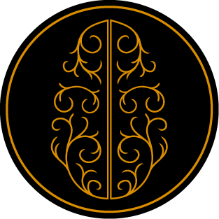
Logo
Clothing
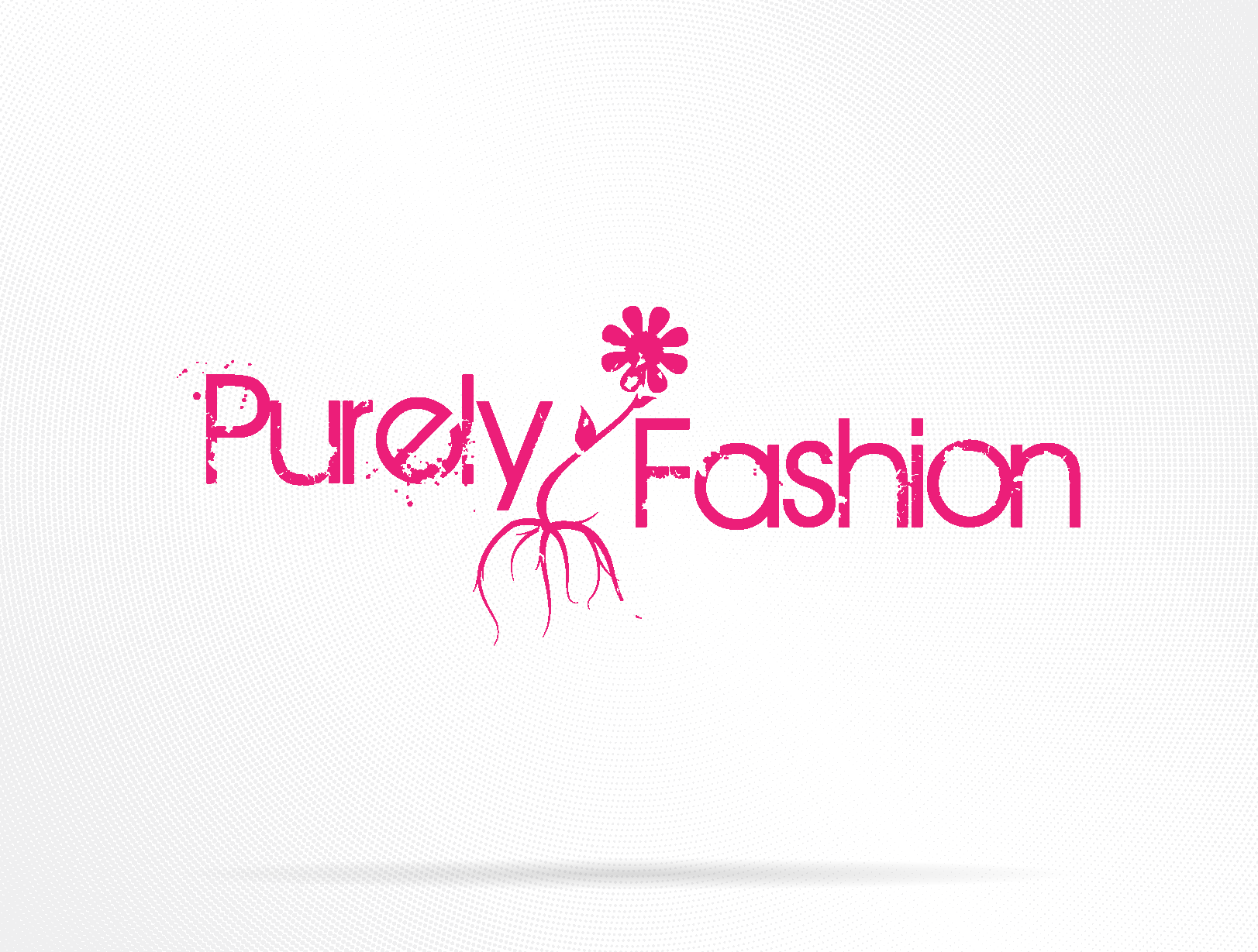
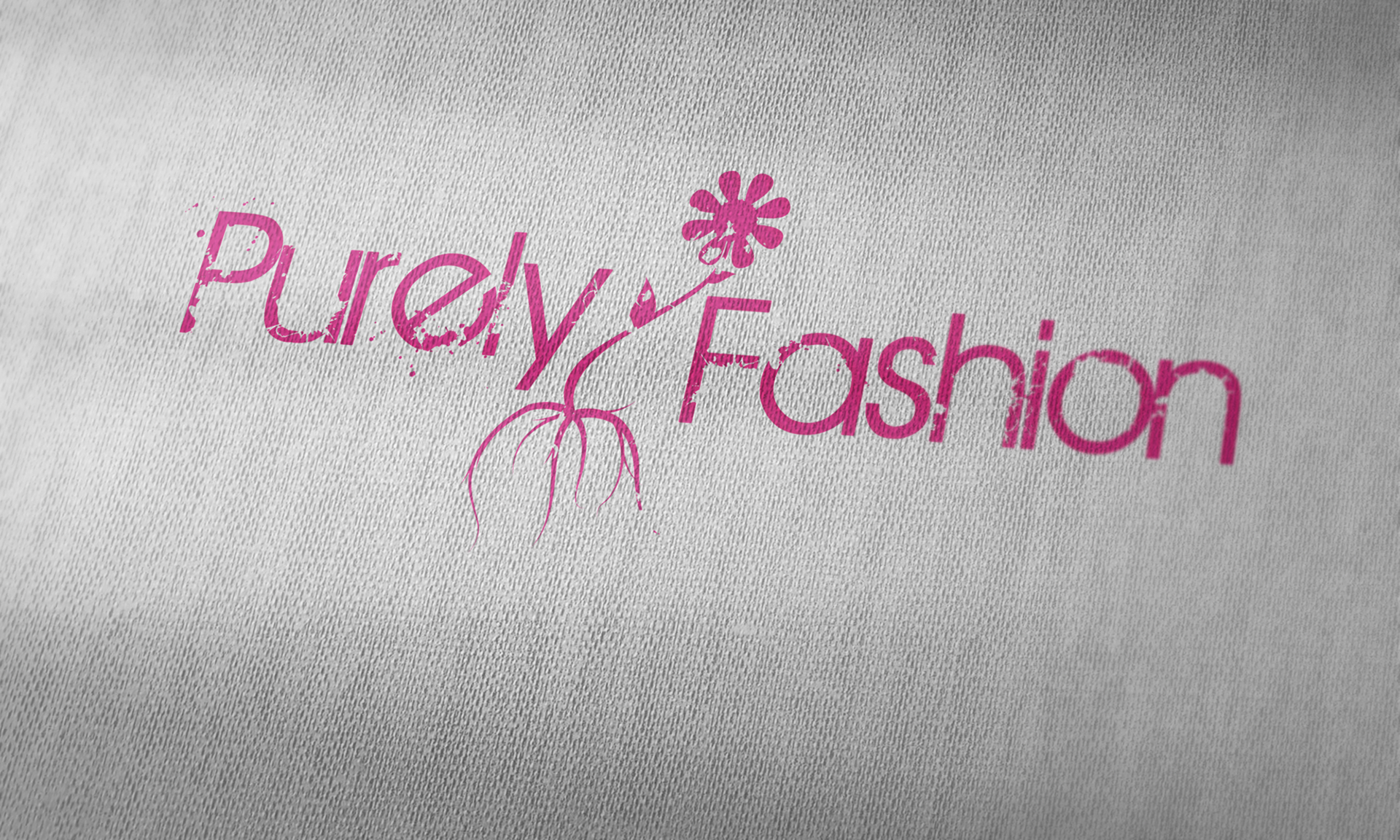
In college I explored paired brands: Purely Fashion (female-focused) and Deep Roots (male-focused). Purely leans lighter and brighter, think Volcom/Billabong energy, with a logo that merges a simple wordmark and a small flower whose roots branch from the letterforms. The type choice was popular (maybe overused) at the time, but the contrast of delicate + grunge still reads.
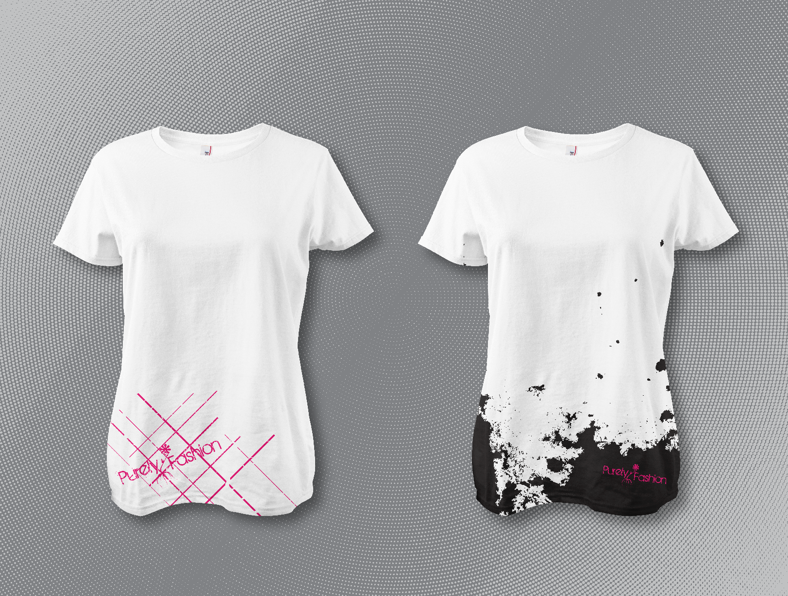
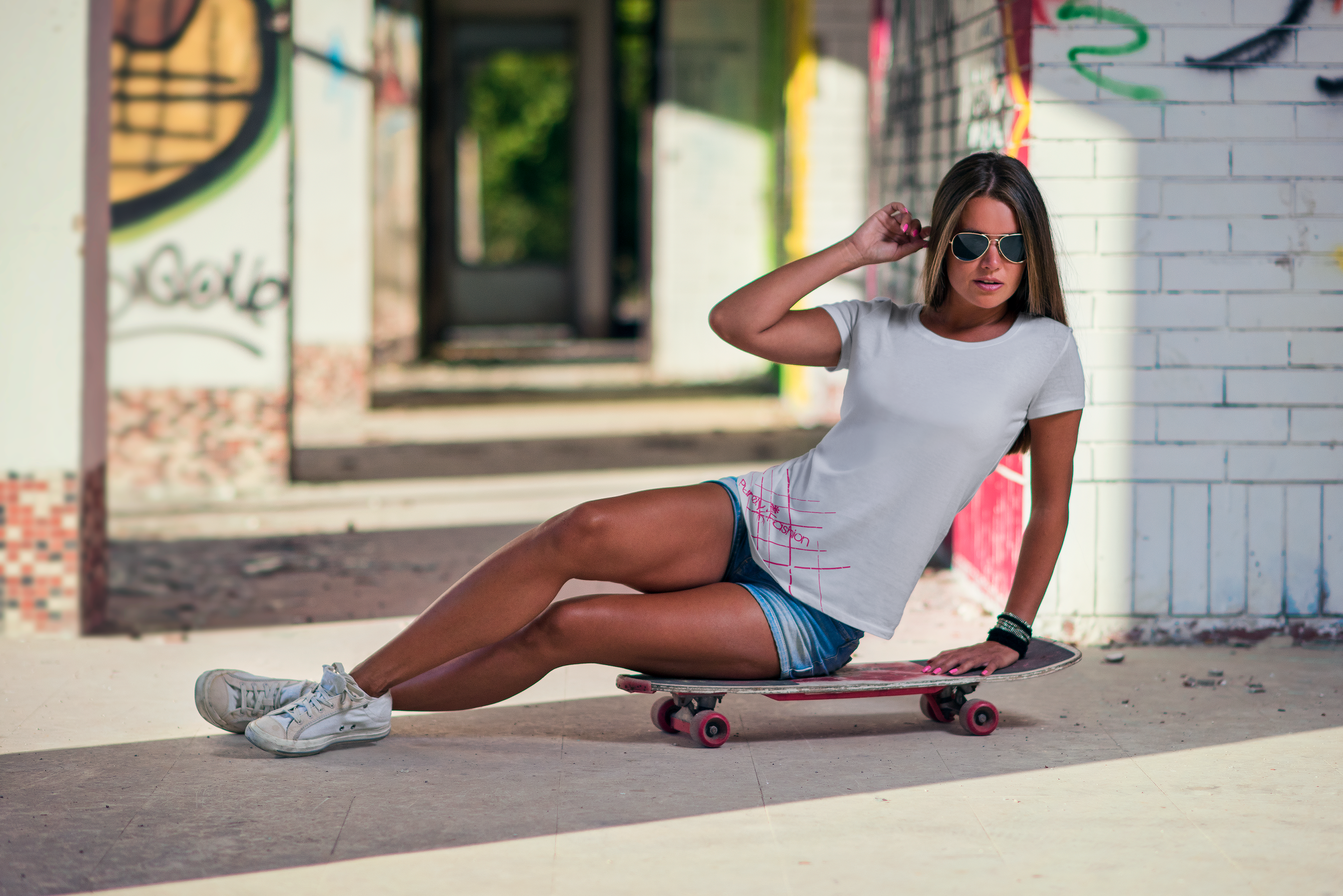
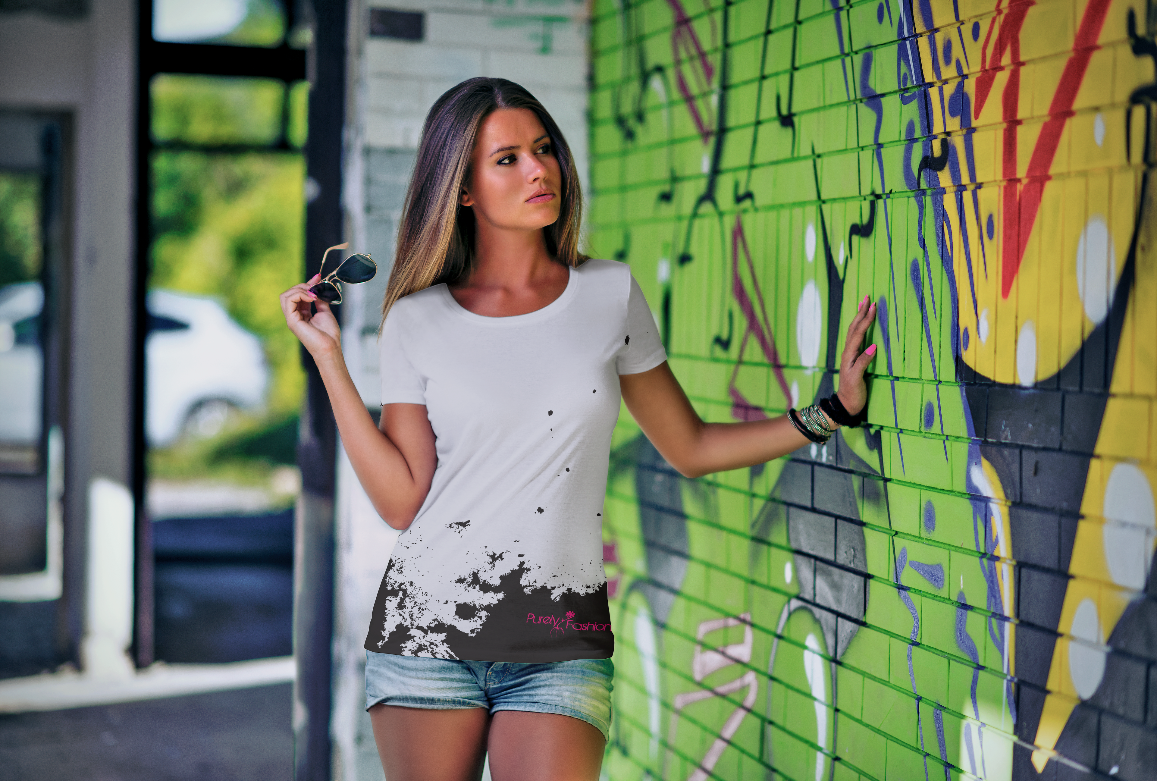
For tees, I kept the branding subtle and used placement graphics for personality: angled magenta linework across the hem on one shirt and a high-contrast ink splash at the bottom on another, with a tiny logo lockup. The idea was bold cool shirts, and grunge was cool.
Reflection:
If I revisit this, I’d refresh the type with something more timeless, keep the rooted-flower idea, and build a tighter system that pairs Purely with its sister brand, Deep Roots, without feeling era-locked.
If I revisit this, I’d refresh the type with something more timeless, keep the rooted-flower idea, and build a tighter system that pairs Purely with its sister brand, Deep Roots, without feeling era-locked.
Tools: Adobe Illustrator | Adobe Photoshop