
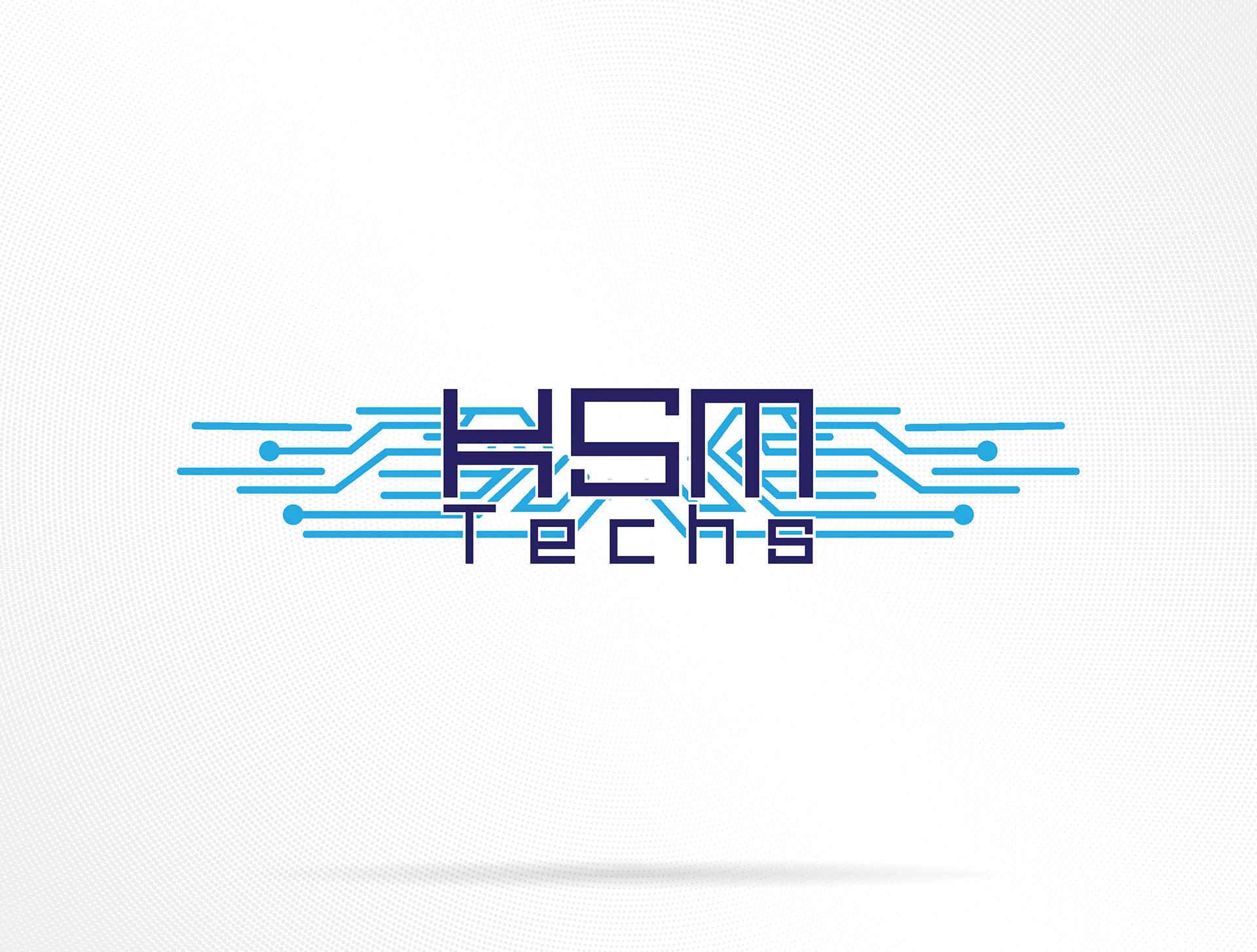
KSM Techs was an early concept for a small IT repair and support business that I planned to start with a few coworkers. Though the venture never launched due to life taking us in different directions, the branding remains a strong example of how visual design can embody technical precision and connectivity.
The logo merges the founders’ initials, K, S, and M, into a geometric, tech-styled wordmark, framed by flowing blue circuitry lines inspired by motherboard traces and the USB symbol’s branching form. The composition evokes a sense of data flow and digital communication, perfectly suited to an IT and technology service provider.
Reflection:
Even though the company never materialized, this project was a valuable exploration of branding within the technology sector, finding that balance between clean professionalism and modern visual energy. It also marked one of my early experiments with integrating symbolic meaning into letterforms, something that’s become a recurring theme in my later design work.
Even though the company never materialized, this project was a valuable exploration of branding within the technology sector, finding that balance between clean professionalism and modern visual energy. It also marked one of my early experiments with integrating symbolic meaning into letterforms, something that’s become a recurring theme in my later design work.
Tools: Adobe Illustrator | Adobe Photoshop