Logo
Clothing
Snowboard

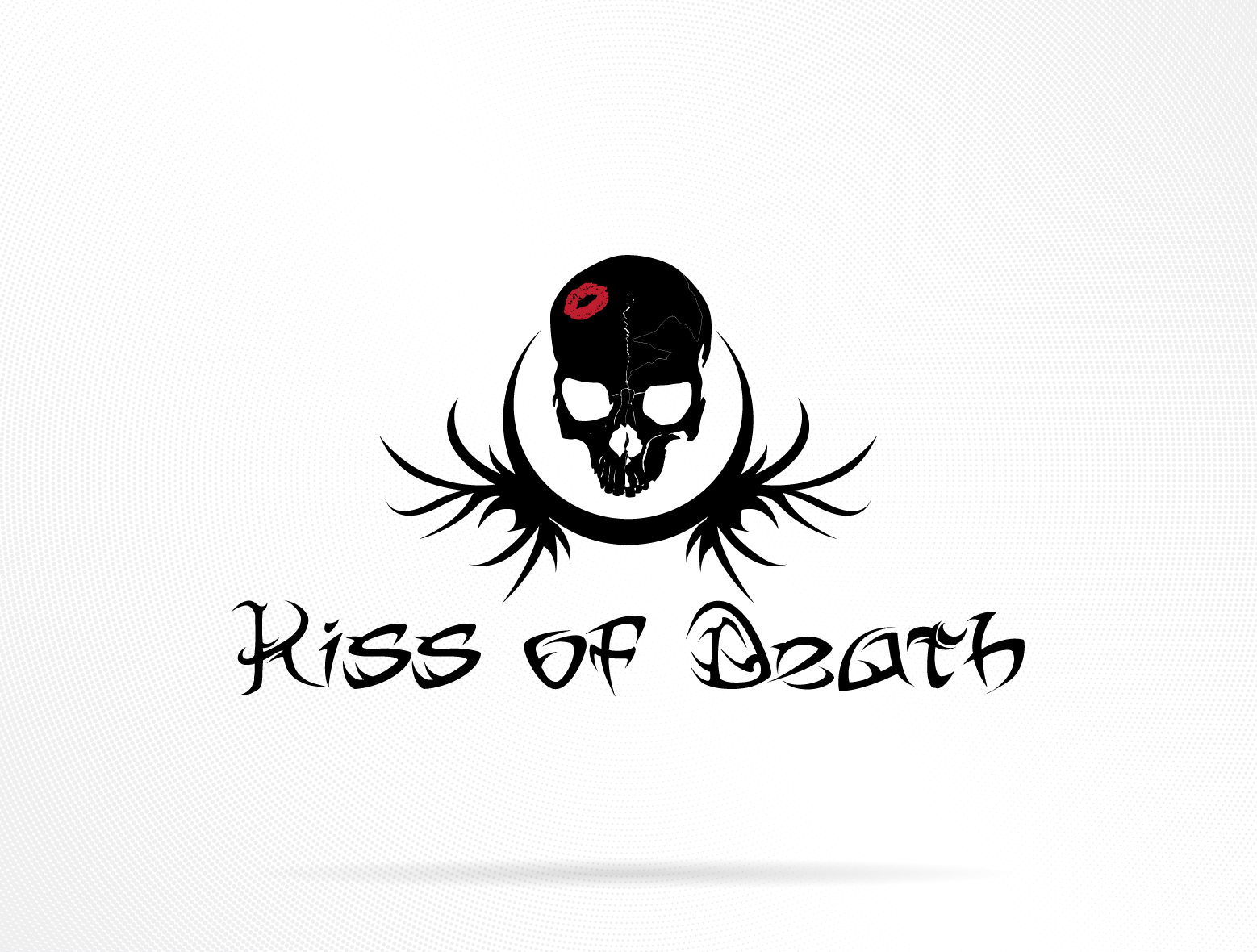
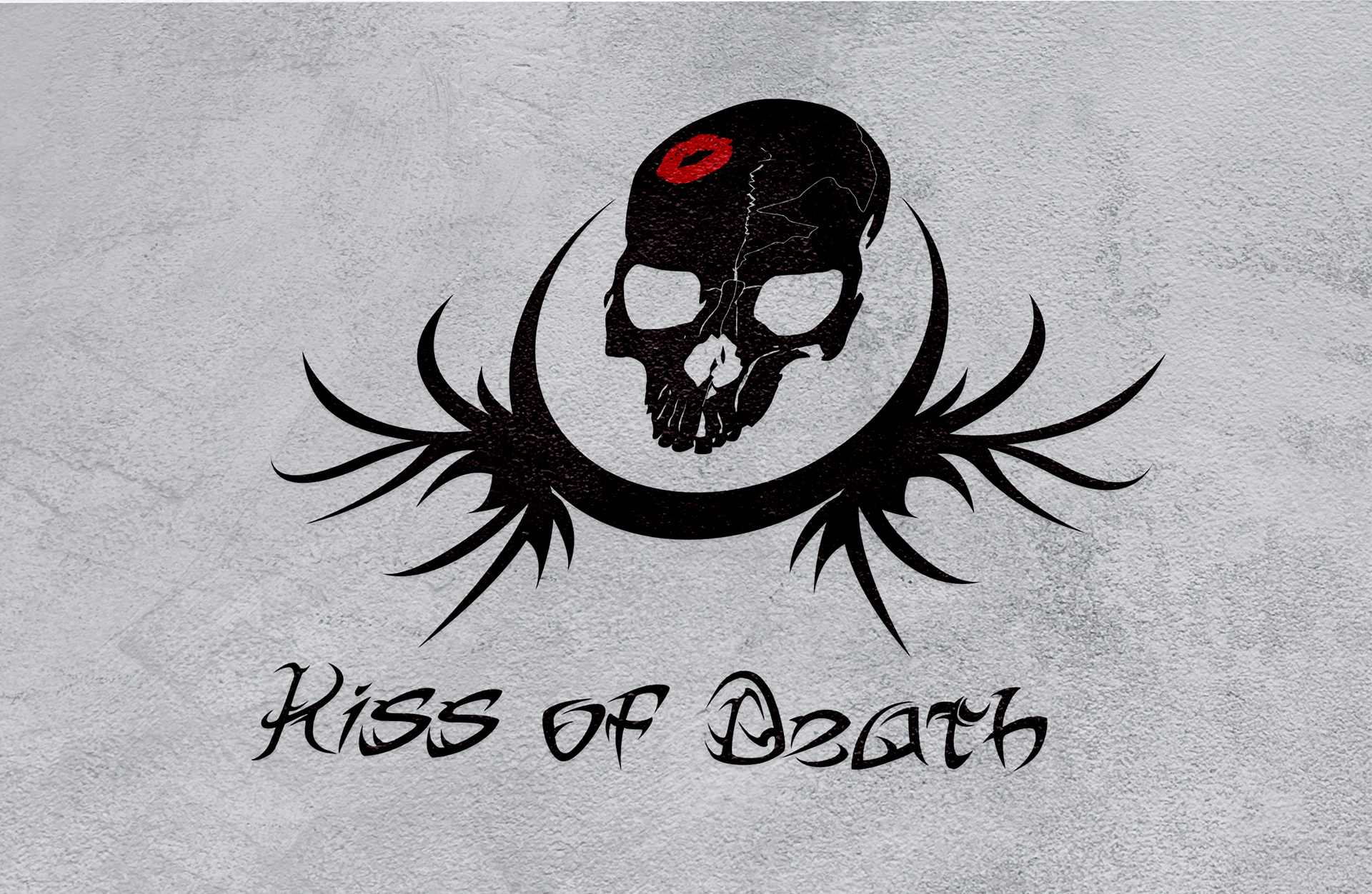
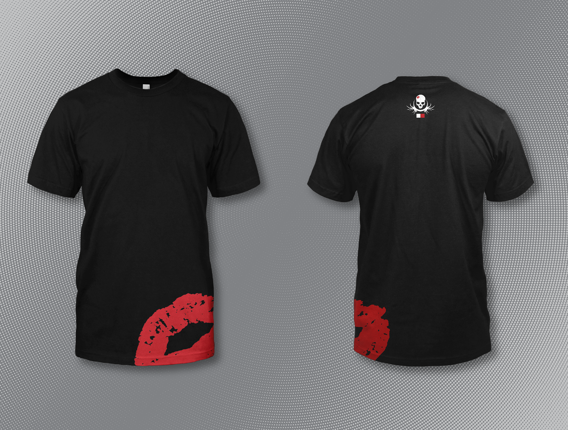
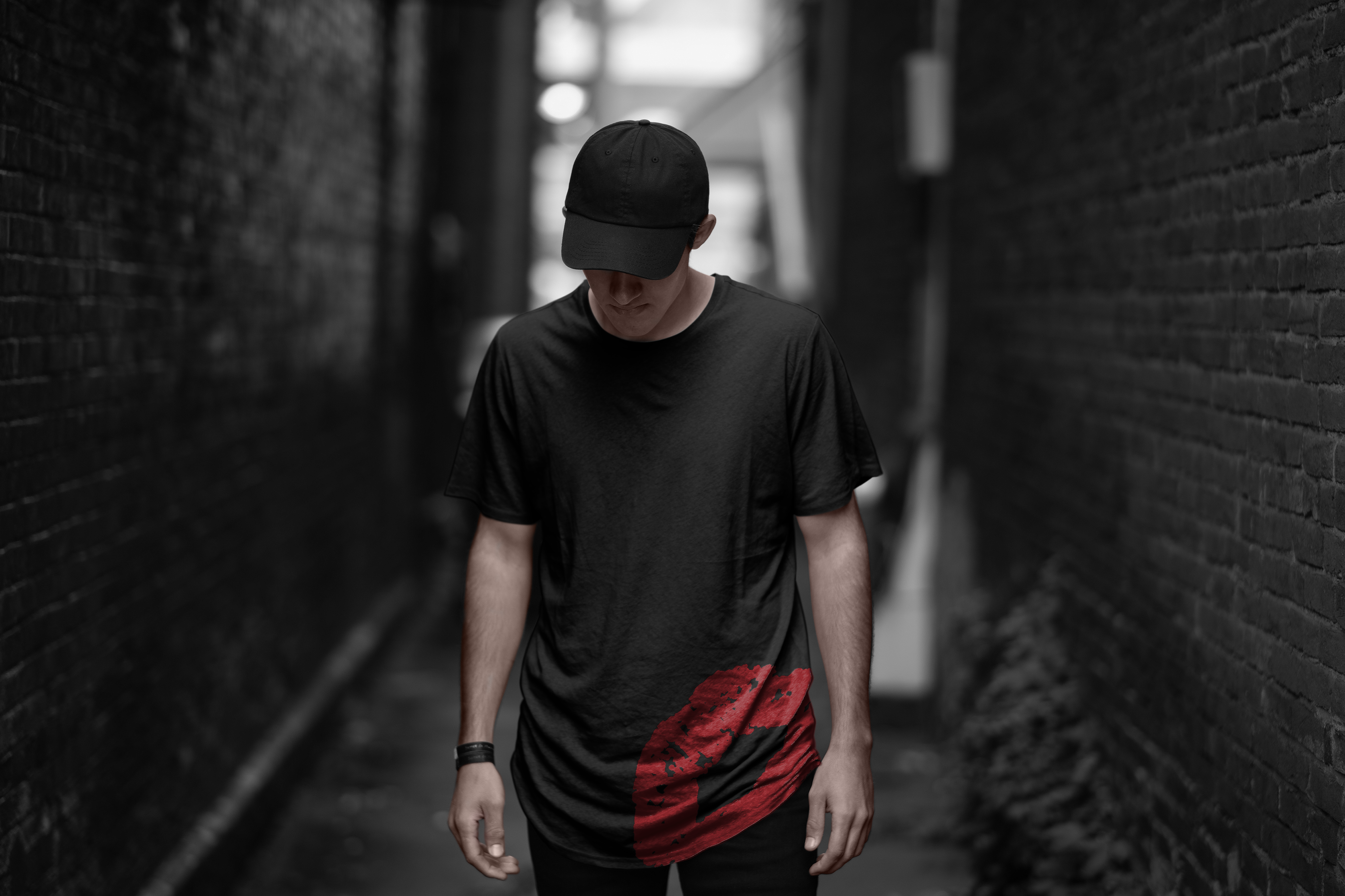
This started as one of my first logos: a stark skull punctuated by a single red lipstick mark. I wanted something that felt equal parts flirt and threat, minimal shapes, high contrast, and a hint of attitude. The tee keeps it simple: a bold red lip print riding the hip and the mark centered high on the back, subtle placement with a punch.
I explored the idea as a snowboard graphic too. The top stayed restrained, nearly all black with a single kiss, while the base went loud with an all-over lip pattern and the edgey “Kiss of Death” lettering. It’s a fun direction, though looking back I’d rein it in for readability and brand consistency.
Reflection:
This project taught me how far a strong mark can carry a brand—and where to stop. The tee’s restraint wins; the board will get a cleaner, more focused rework next.
This project taught me how far a strong mark can carry a brand—and where to stop. The tee’s restraint wins; the board will get a cleaner, more focused rework next.
Decided to Revisit this Branding. You can see the updated Branding Here
Tools: Adobe Illustrator | Adobe Photoshop