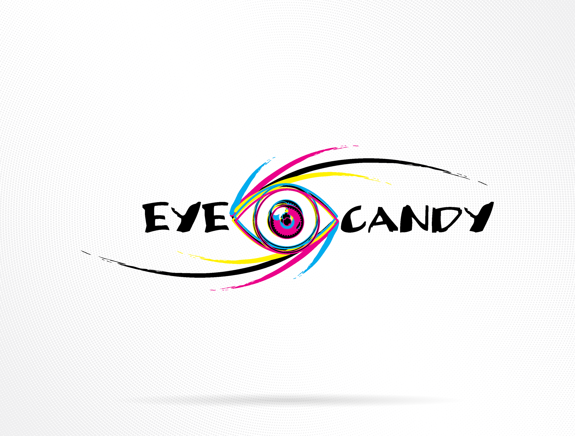
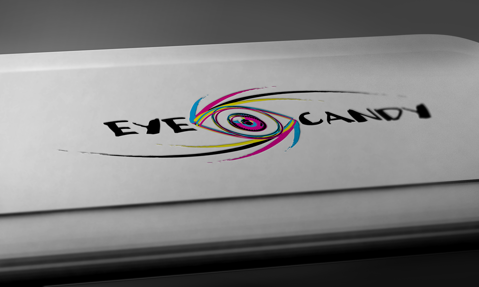
Back in college I was cranking out brand ideas for fun, and “Eye Candy” stuck, partly a nod to the phrase from a book I was reading, partly because I loved working in CMYK. The mark blends rough brush lettering with a swirling eye built from cyan, magenta, yellow, and black strokes. It’s definitely on-the-nose (literally), but the color energy and motion still feel right for a board or tee.
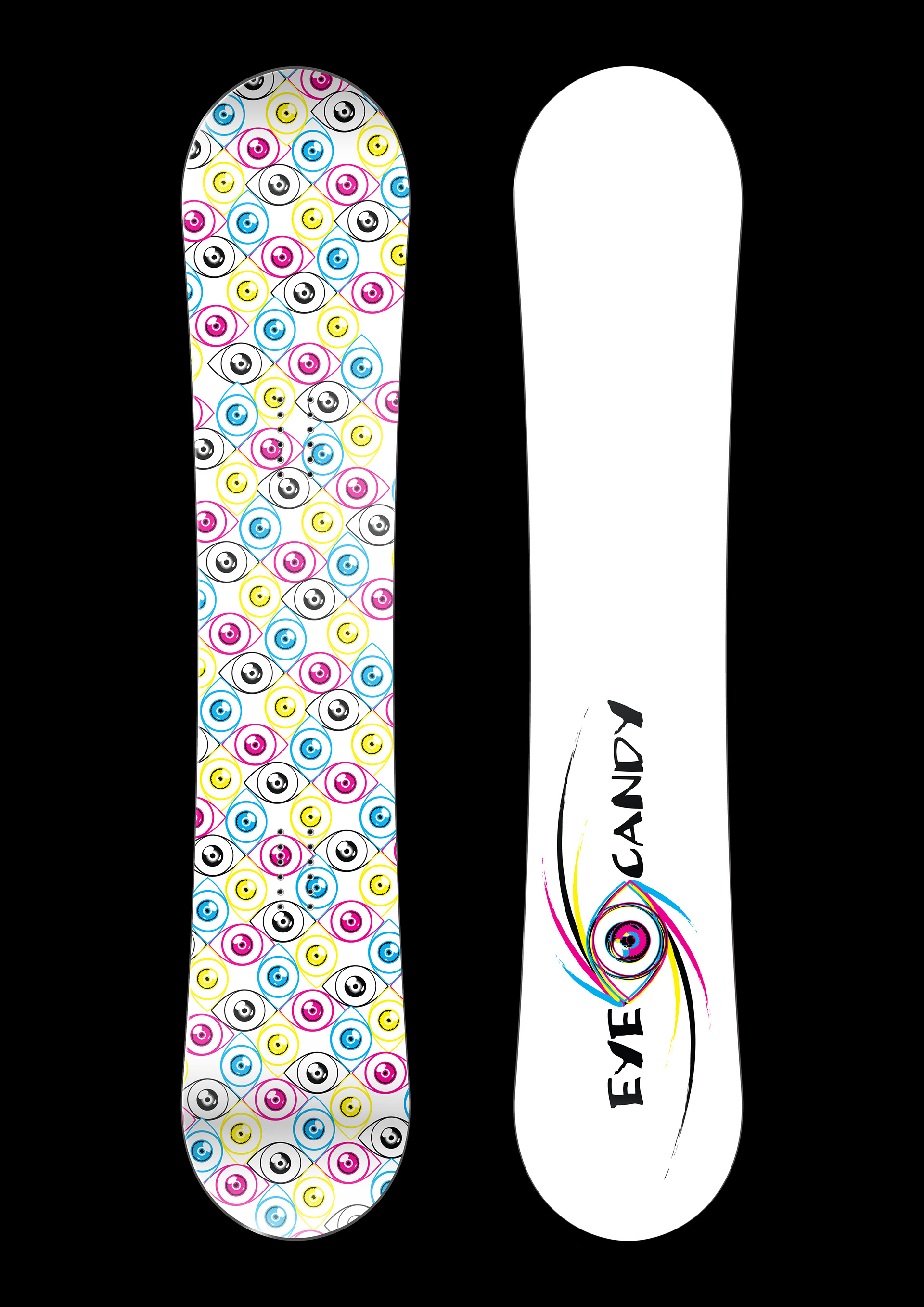
I mocked it up as a snowboard graphic too. One side carries a big vertical logo; the other uses a repeating eye pattern. If I revisited it today, I’d swap the sides, keep the top of the board clean with a single mark for readability and push the all-over pattern to the base for personality in motion.
Reflection:
I’d love to do a V2, dial back the literal eyeball, and possibly take in another direction.
I’d love to do a V2, dial back the literal eyeball, and possibly take in another direction.
Tools: Adobe Illustrator | Adobe Photoshop