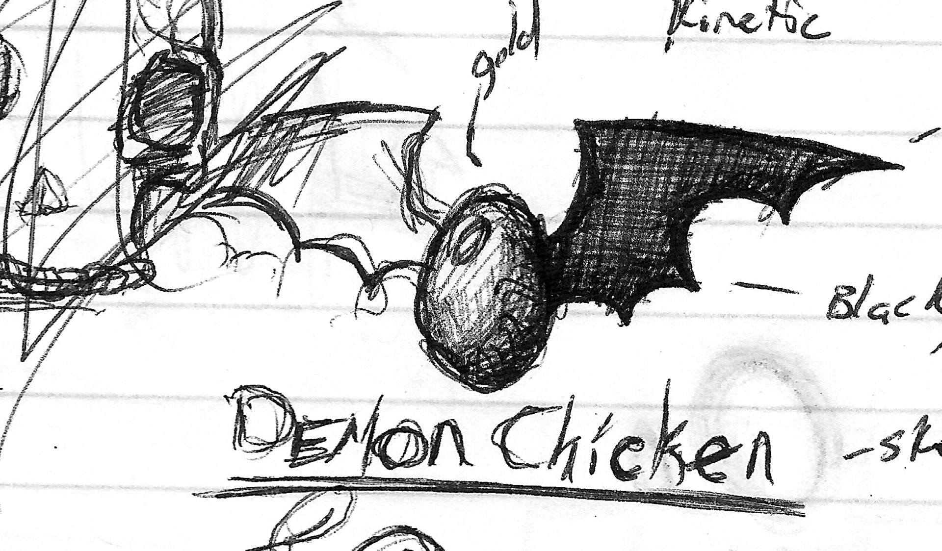
Sketch
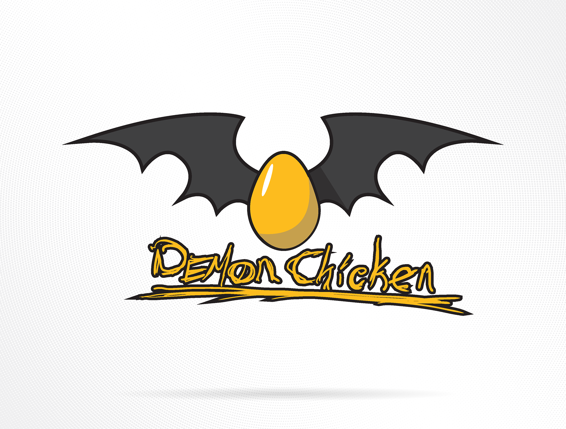
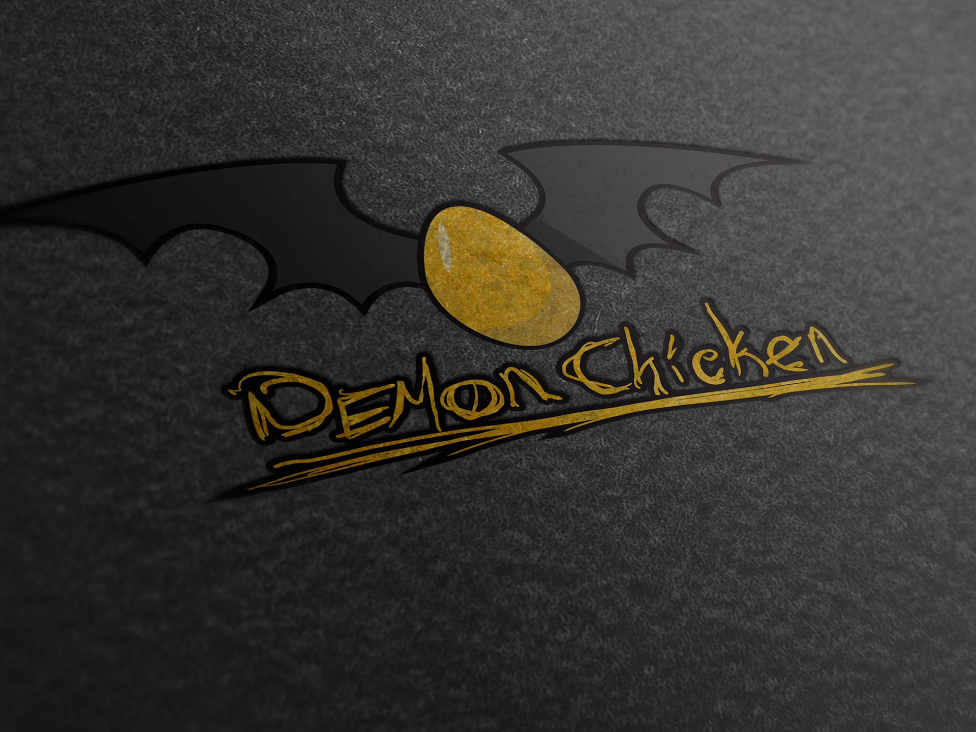
Logo
Demon Chicken started as a random doodle during a physics class, born from the idea of pairing two completely unrelated words to see what kind of concept might emerge. The result, a mischievous egg with bat wings, struck the perfect balance between playful absurdity and visual intrigue.
The design plays with contrasts: the innocent yellow egg versus the dark, winged silhouette that gives it a devilish twist. The hand-drawn typography reinforces that lighthearted chaos, giving it a personality that feels equal parts chaotic energy and creative fun.
Though not tied to any formal brand yet, the concept has the potential to evolve into something bigger, perhaps a gaming or visual novel studio, where its tongue-in-cheek tone and imaginative flair would fit right in.
Reflection:
Sometimes the most spontaneous ideas end up sparking the best creative directions. Demon Chicken represents that kind of free-flowing inspiration, where design isn’t about briefs or clients, but simply letting imagination take flight (or… grow wings).
Sometimes the most spontaneous ideas end up sparking the best creative directions. Demon Chicken represents that kind of free-flowing inspiration, where design isn’t about briefs or clients, but simply letting imagination take flight (or… grow wings).
Tools: Adobe Illustrator | Sketchbook