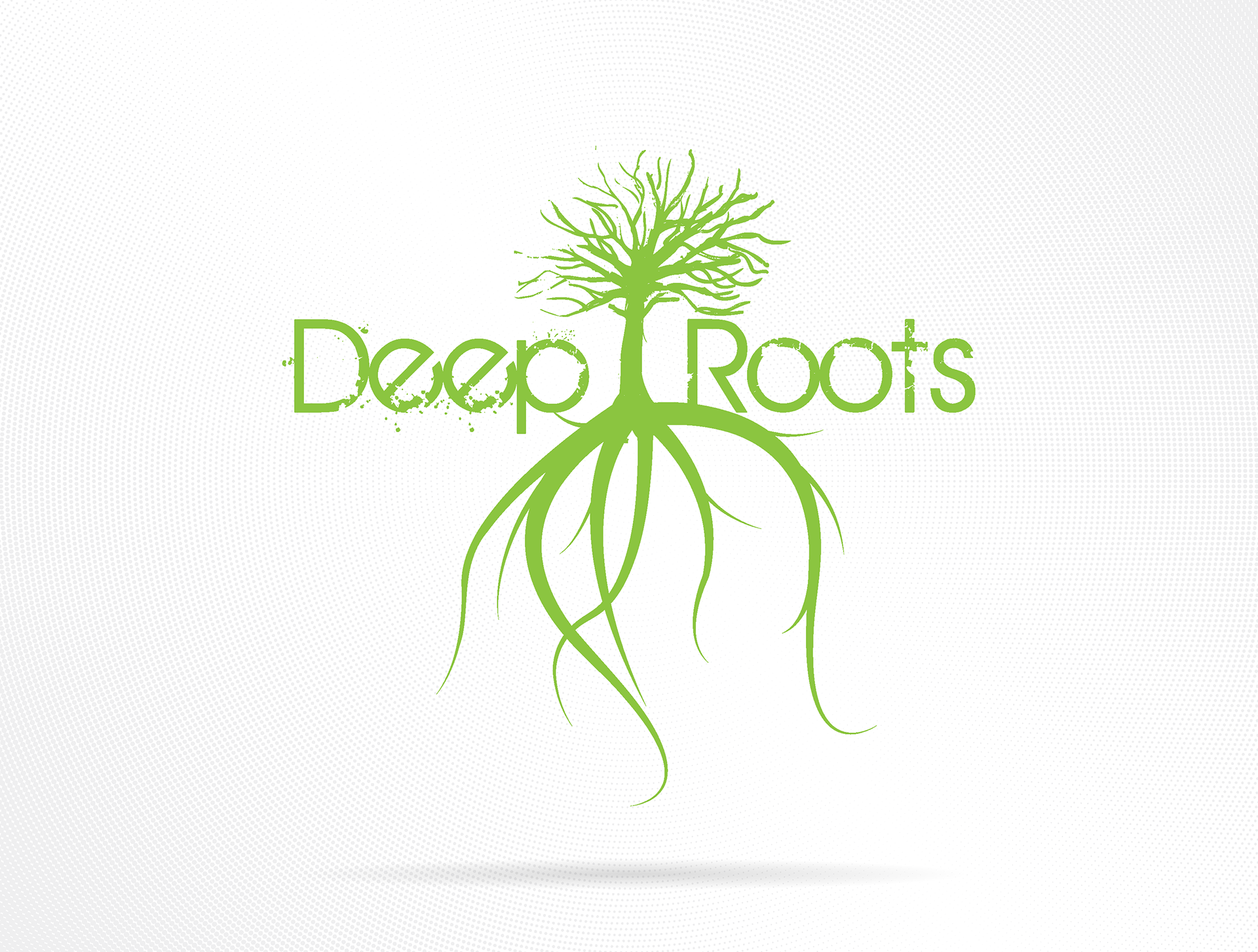
Deep Roots was designed as the male counterpart to Purely Fashion, inspired by the surf and skate brands I grew up around like Volcom and Rip Curl. The goal was simple: create something grounded, natural, and honest. The logo captures that balance, a sturdy tree rising above a tangle of roots, rendered in bold green with a slightly weathered edge. It’s about staying connected to where you come from while pushing forward.
While I never made shirts for this one, it remains one of those early concepts that helped me understand brand duality, how two identities can grow from the same seed yet express themselves in totally different ways.
Reflection:
If I revisit Deep Roots, I’d rework the symbo with a similar concept the symbol and update the typography for more personality and flow, something that feels raw yet refined, perfectly paired with Purely Fashion’s bright energy.
If I revisit Deep Roots, I’d rework the symbo with a similar concept the symbol and update the typography for more personality and flow, something that feels raw yet refined, perfectly paired with Purely Fashion’s bright energy.
Tools: Adobe Illustrator | Adobe Photoshop