Cold Coffee was one of the most creatively fulfilling collaborations I’ve worked on with friends. Though it never became a commercial venture, it was a huge success in terms of creative growth. The brand started as a web comic series, eventually expanding into podcasts and gaming discussions, something of a grassroots version of what Rooster Teeth represented at the time.
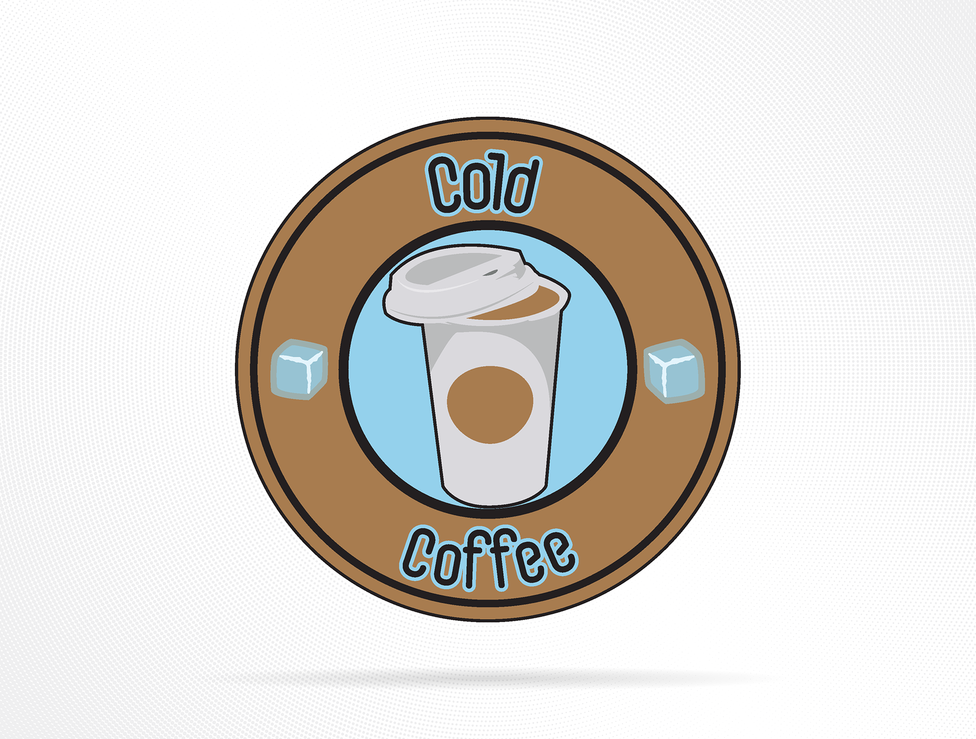
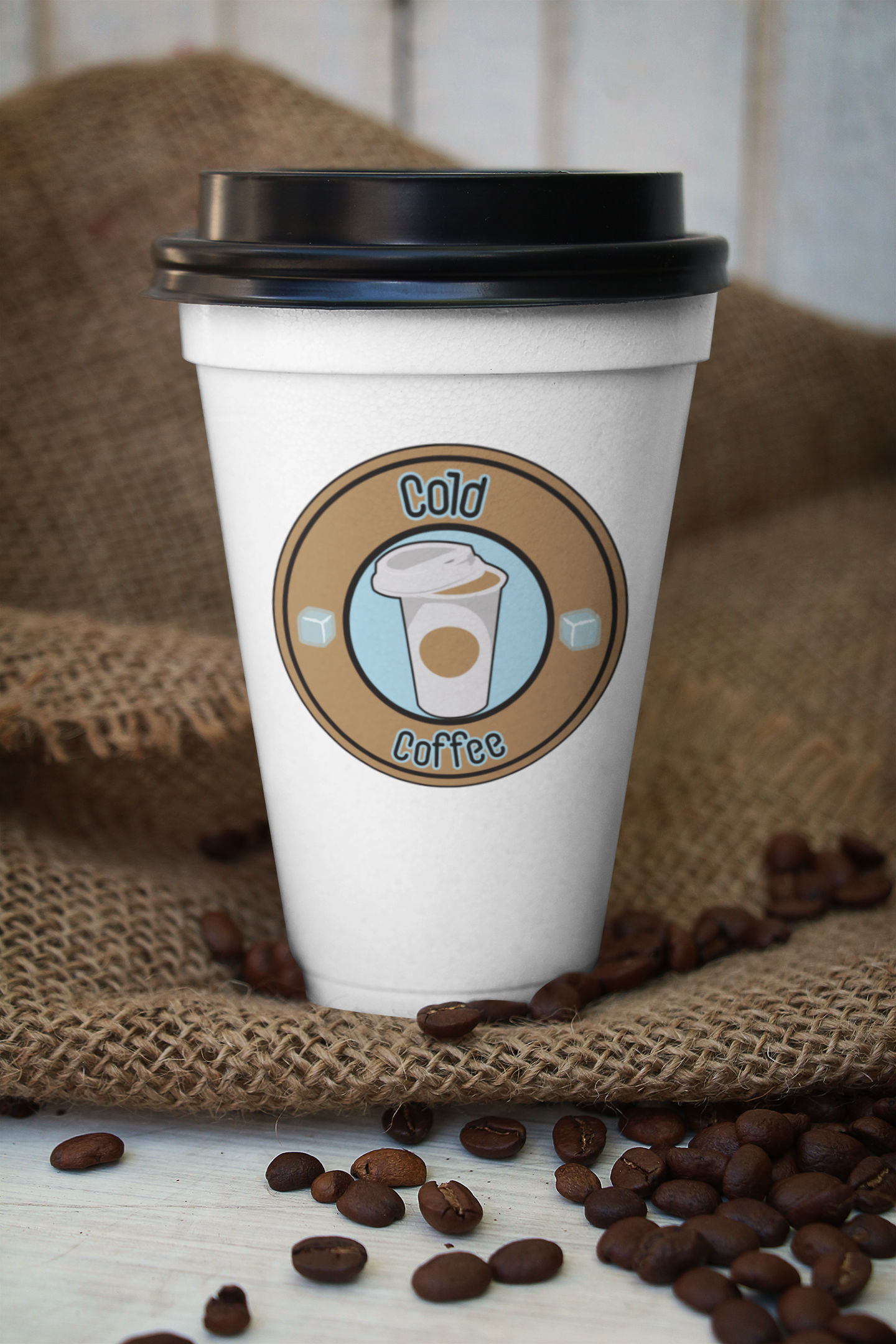
The logo was intentionally designed as a parody of Starbucks’ iconic mark, mirroring its circular layout and coffee motif but with a lighthearted twist. Instead of aiming for sleek professionalism, I leaned into a more cartoonish and DIY aesthetic that matched our tone, a mix of humor, fandom, and creative enthusiasm. The blend of coffee tones with cool blues reflected the “cold” aspect while keeping it warm and inviting.
Reflection:
Cold Coffee was an important milestone in my creative evolution. It taught me the value of collaboration, consistency, and brand storytelling, all while reinforcing how design can set the tone for a community or project’s identity. It also opened the door to my later passion for story-driven media, especially comics and graphic novels. If I were to revisit it now, I’d explore refining the logo’s structure and typography for a more polished feel, while keeping its playful, indie charm intact.
Cold Coffee was an important milestone in my creative evolution. It taught me the value of collaboration, consistency, and brand storytelling, all while reinforcing how design can set the tone for a community or project’s identity. It also opened the door to my later passion for story-driven media, especially comics and graphic novels. If I were to revisit it now, I’d explore refining the logo’s structure and typography for a more polished feel, while keeping its playful, indie charm intact.
Tools: Adobe Illustrator | Adobe Photoshop