
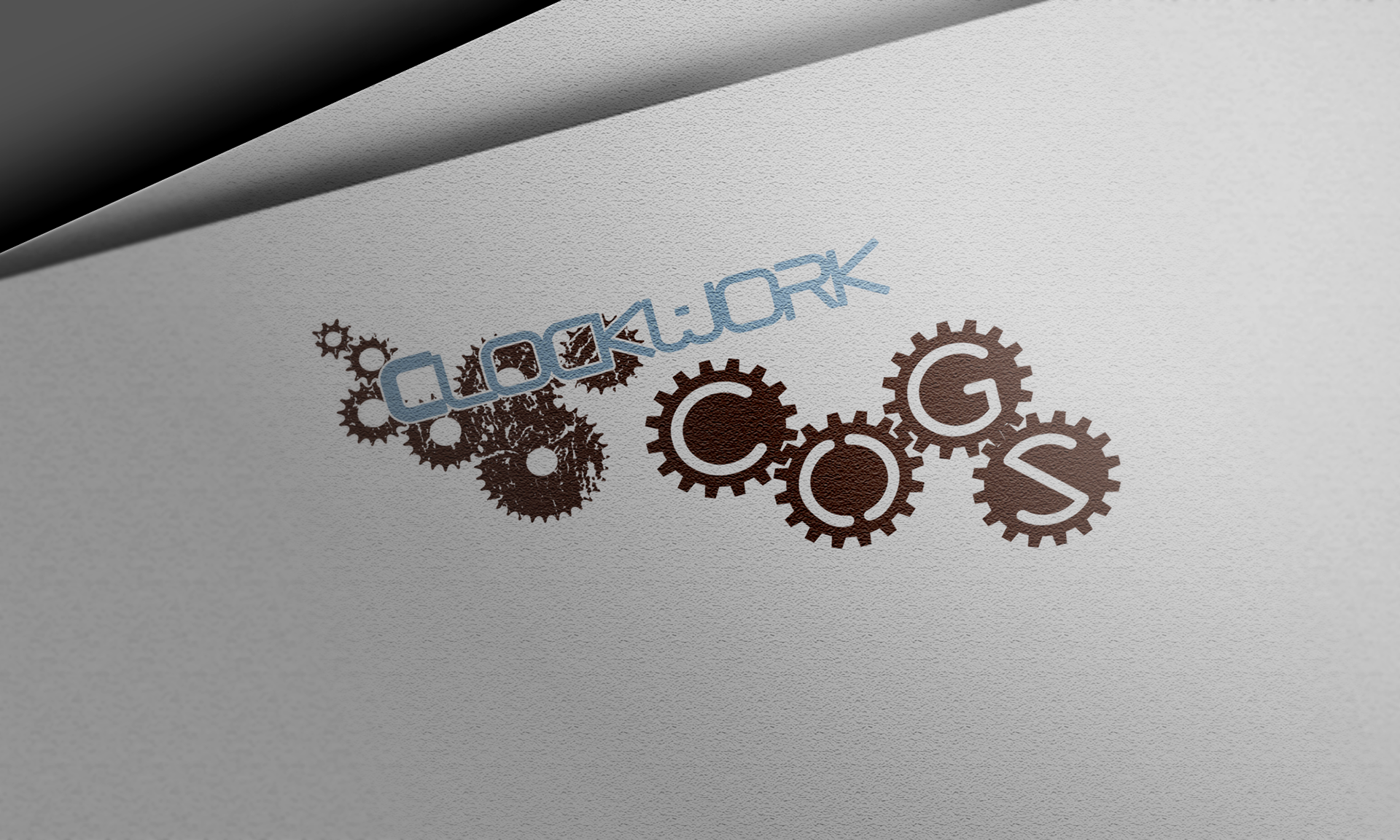
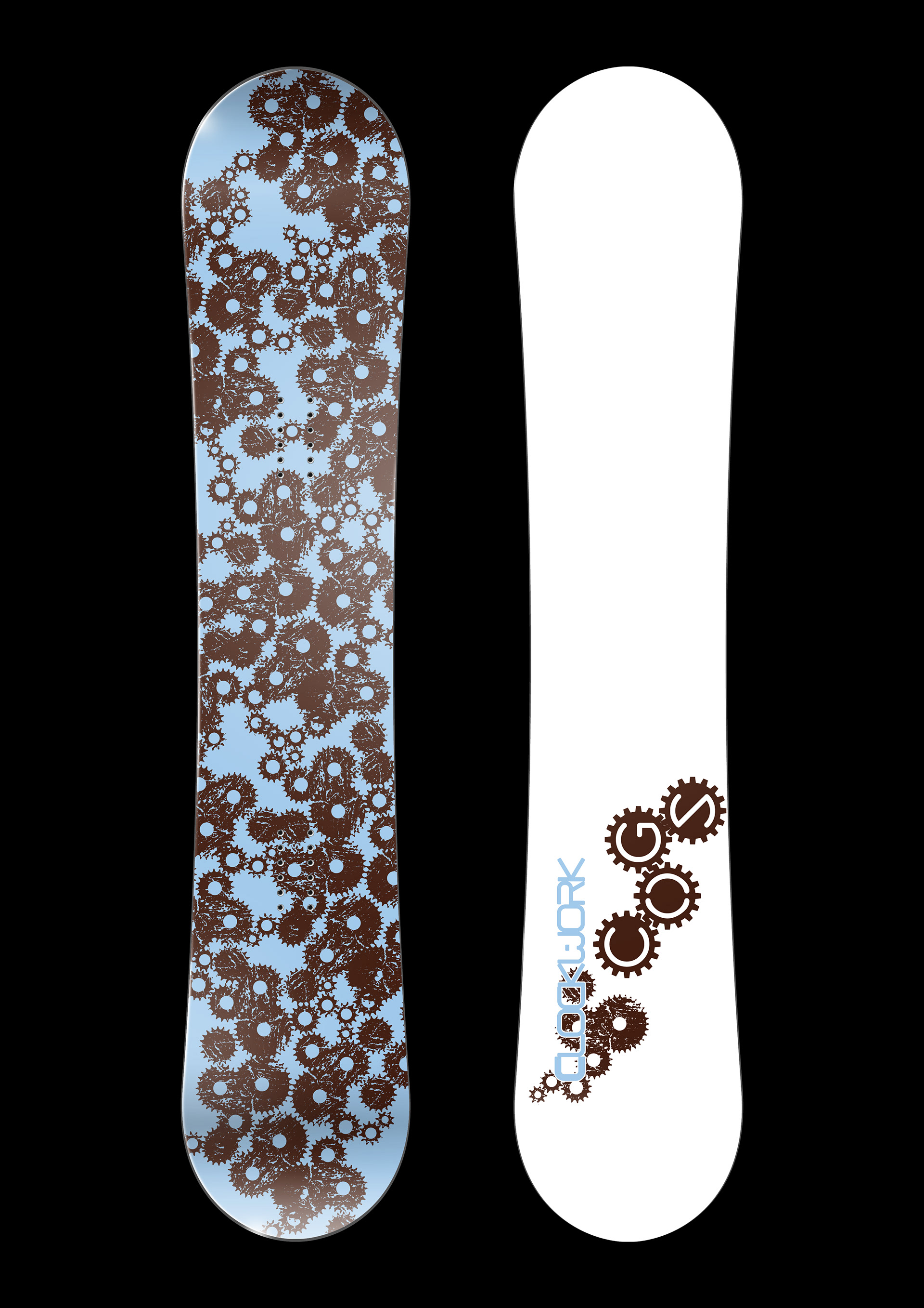
Clockwork Cogs was envisioned as the flagship board series for the Clockwork Boards brand, a concept my friends and I developed under our creative group, The Guild. Drawing inspiration from the intricate mechanics of clockwork systems, the design celebrates motion, precision, and craftsmanship, values at the heart of both engineering and snowboarding.
The logo and board graphics feature an interconnected network of distressed gears, symbolizing the harmony of parts working together, much like the rider, board, and mountain. The cool sky-blue and rust-brown palette represents the meeting of technology and nature: metal and snow, machine and mountain.
Though the brand never reached full production, Clockwork Cogs remains a project that taught me about product branding, surface design, and technical mock-ups for real-world application. It stands as an early exploration of visual storytelling through form and function, where every gear turns toward creative motion.
Tools: Adobe Illustrator | Adobe Photoshop