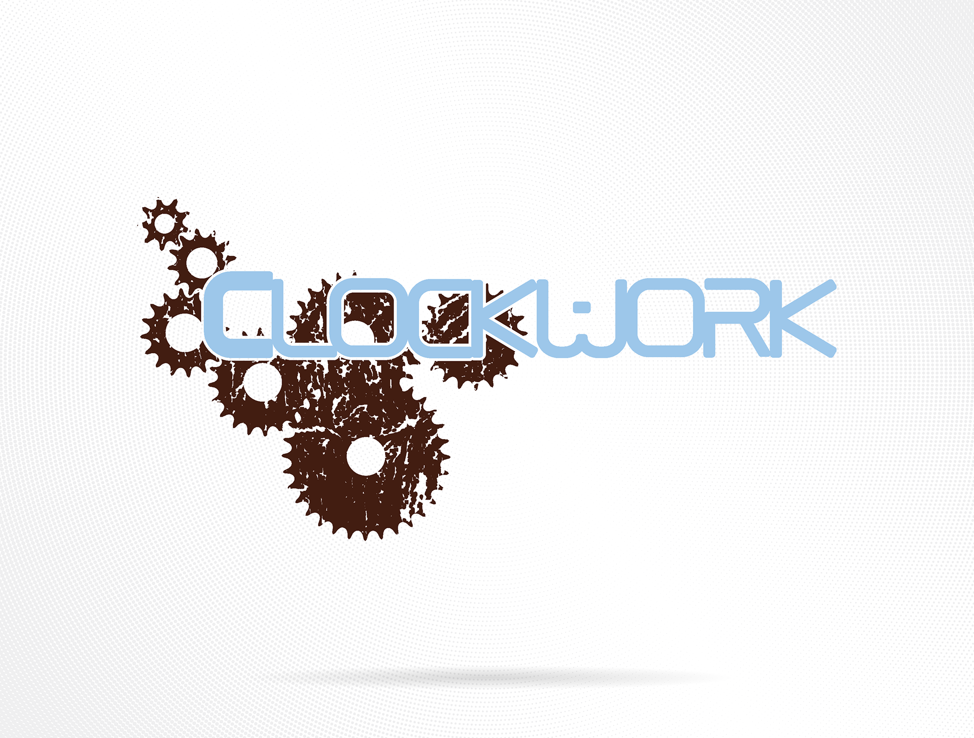
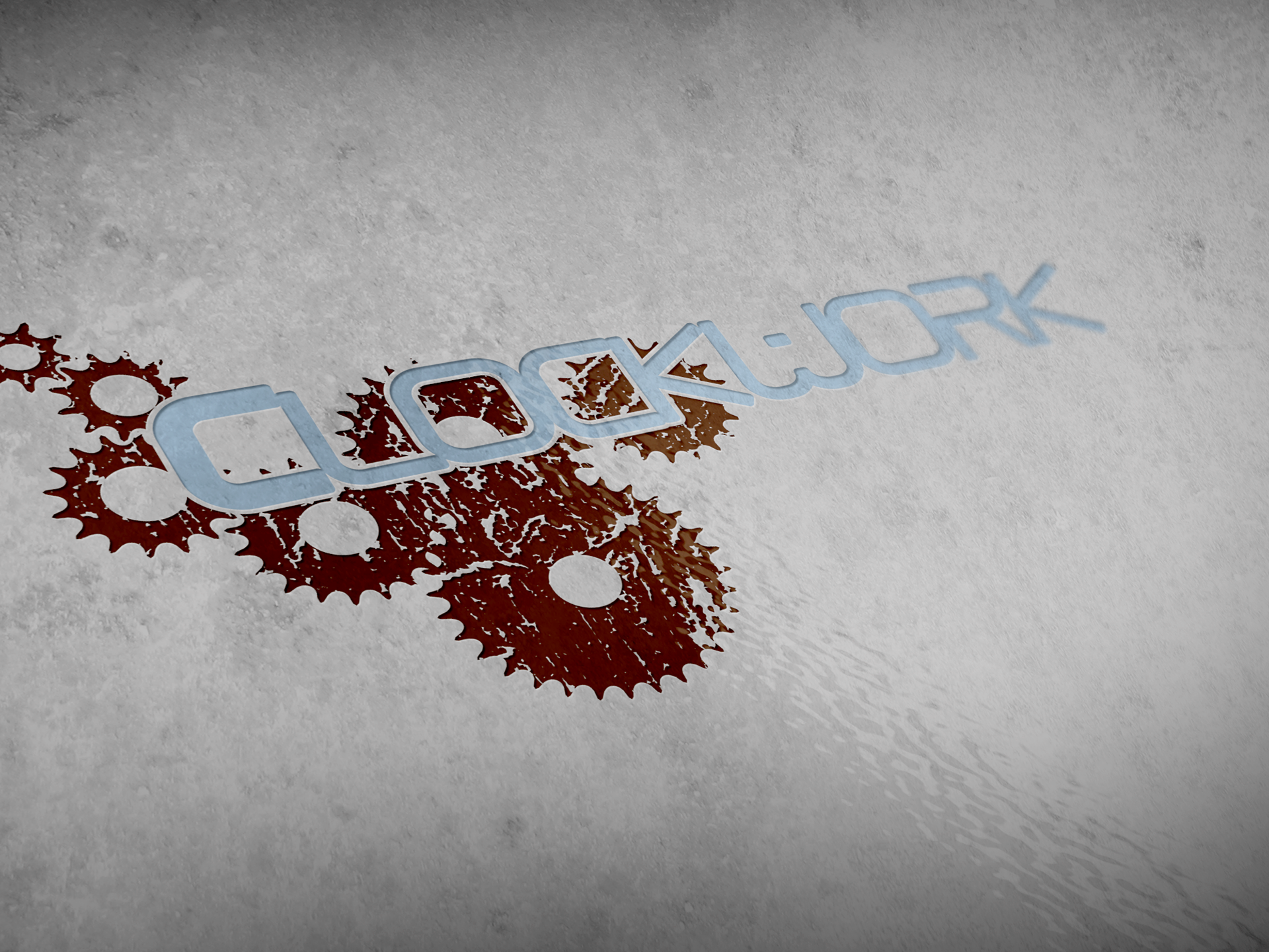
Clockwork Boards was a concept born during my college years, a collaboration between friends under our design collective, The Guild. The brand aimed to merge mechanical precision with the artistry and individuality of snowboarding. The logo reflects that balance: sleek, futuristic typography inspired by digital clock displays paired with distressed, interlocking gears that symbolize the inner workings of both machines and minds.
The project became an exercise in both brand development and product design, as I dove deep into snowboard technology, studying construction, materials, and the science behind board flex and performance. Though The Guild eventually disbanded and the brand never launched, Clockwork Boards remains one of my earliest explorations into building a complete brand identity from concept to execution—a testament to collaboration, learning, and creative drive.
Tools: Adobe Illustrator