

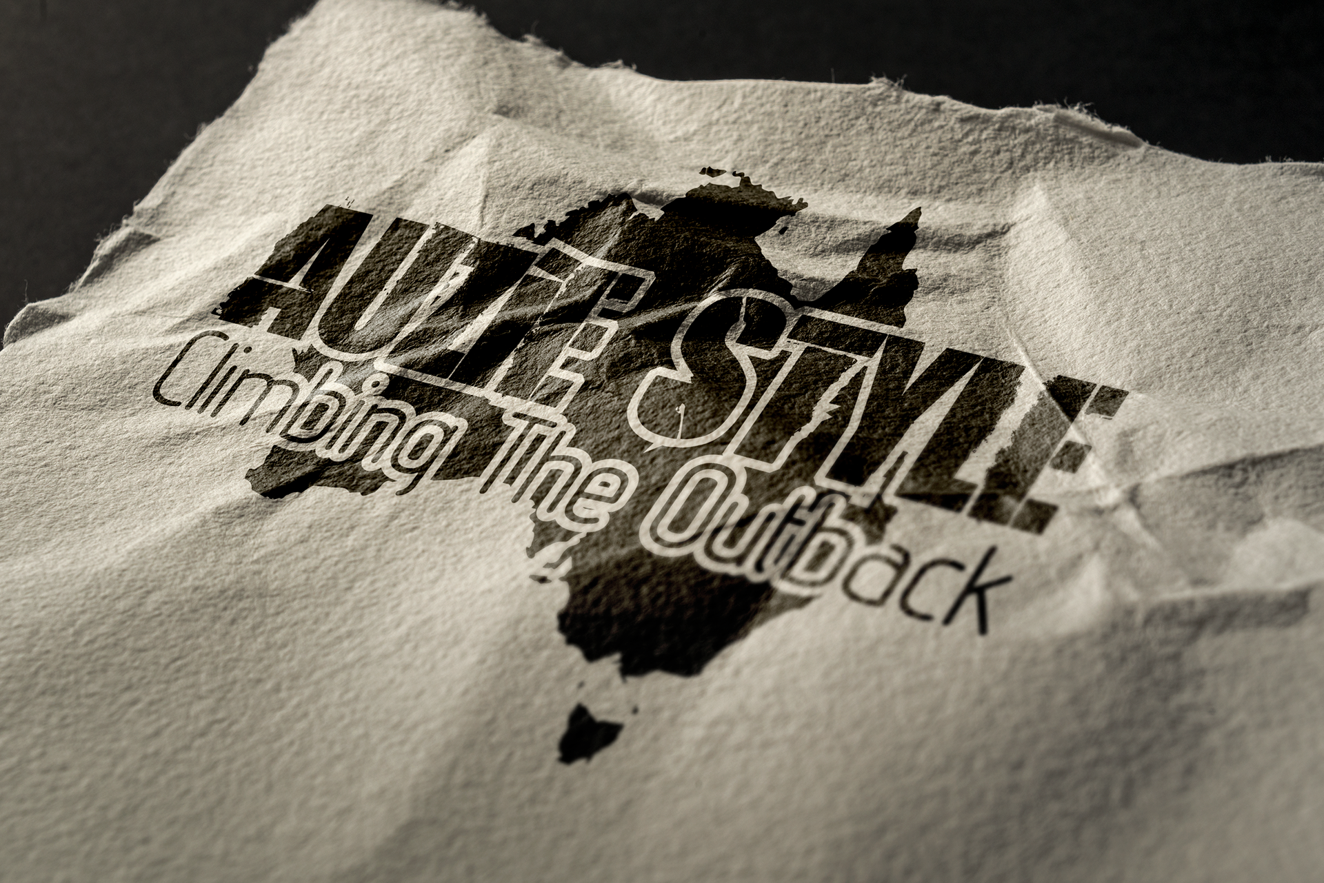
Auzie Style: Climbing the Outback was a creative exercise I took on one summer while visiting California. Wanting to keep my design skills sharp, I asked a friend to act as a “client” and give me a project brief. They came up with an imaginary outdoor magazine called Auzie Style, centered around climbing and exploration in Australia, and from there, this logo was born.
The design features a rugged, distressed typeface that evokes the grit and texture of the outback, contrasted by clean supporting text to maintain readability and balance. The silhouette of Australia serves as both a geographical anchor and a design element, grounding the brand in its environment. The earthy brown palette reinforces the natural tones of the Australian landscape, creating a visual identity that feels adventurous, weathered, and distinctly Australian.
Reflection:
This project was a valuable self-directed design challenge, an opportunity to simulate real-world client work and develop a logo with context, personality, and storytelling. It reminded me how effective a simple concept can be when rooted in strong visual associations and purposeful type choice.
This project was a valuable self-directed design challenge, an opportunity to simulate real-world client work and develop a logo with context, personality, and storytelling. It reminded me how effective a simple concept can be when rooted in strong visual associations and purposeful type choice.
Tools: Adobe Illustrator