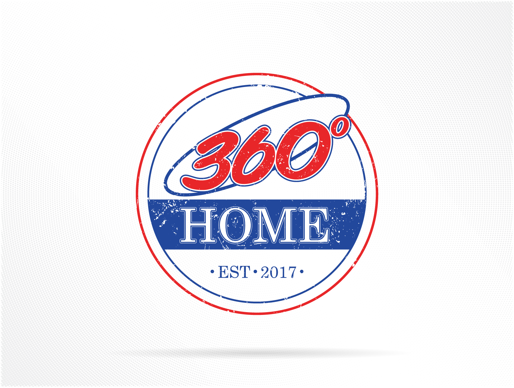
This project was created for a client expanding their construction business into a home improvement branch under the name 360° Home. The goal was to design a logo that maintained visual continuity with their existing 360 Construction branding, while introducing a warmer, more approachable aesthetic suited for residential clients.
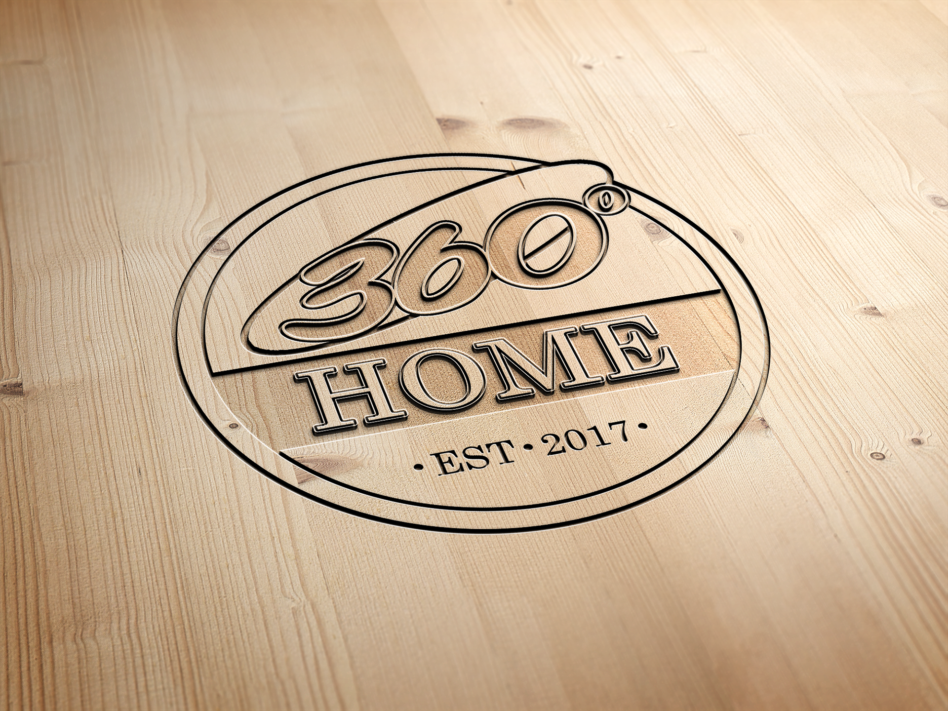
After several iterations, we finalized a retro badge-style logo using a red, white, and blue palette that communicates trust, craftsmanship, and hometown pride. The distressed texture variation adds a rugged, hands-on feel, while the clean version ensures versatility across signage, vehicles, and promotional materials.
Typography choices were made to balance boldness and familiarity, with the curved “360°” adding motion and personality, and the “HOME” in a sturdy serif type reinforcing the brand’s reliability and foundation-focused services.
Reflection:
This project was a great exercise in brand continuity and evolution. It challenged me to respect an existing identity while creating something fresh and distinct. The distressed option remains one of my favorites, it captures that authentic, hardworking aesthetic that fits the construction and home industries perfectly.
This project was a great exercise in brand continuity and evolution. It challenged me to respect an existing identity while creating something fresh and distinct. The distressed option remains one of my favorites, it captures that authentic, hardworking aesthetic that fits the construction and home industries perfectly.
Tools: Adobe Illustrator