
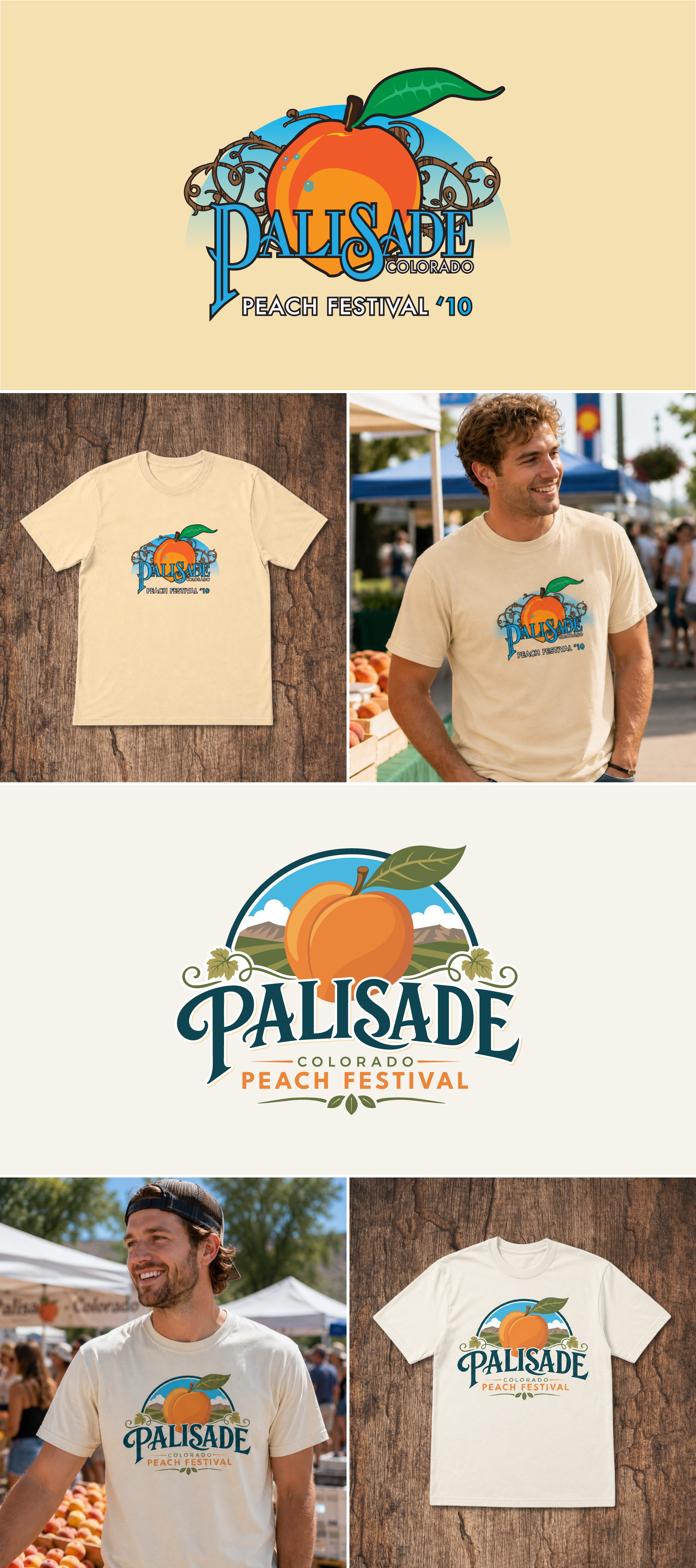
This project started back in 2010 as a college class assignment. Each student had to create a logo concept for the Palisade Peach Festival, with the idea that it could work across posters, shirts, and other event materials.
At the time, I focused on the obvious star of the event: the peach. The original design used a bright peach, soft sky colors, vine details, and decorative lettering to make it feel fun, local, and welcoming. Looking back, I still like the heart of the idea, even though there are plenty of things I would handle differently now.
For this portfolio update, I decided to revisit the concept and redesign it with the experience I have now. I wanted to keep the same warm, festival feel, but clean up the structure, improve the typography, simplify the details, and make the whole mark feel more polished and usable.
The updated version feels like a better balance of playful and professional. It still has the peach, the Colorado landscape, and the small decorative touches, but the layout is stronger, the type is cleaner, and the design feels more ready for real-world use on shirts, posters, signage, and event merch.
This was a fun project to bring back because it shows the difference between where I started and how much my eye has changed over the last 16 years. The original had a good idea in it. The redesign is me taking that idea and finally giving it the execution I wish I had back then.
Tools: Adobe Illustrator | Adobe Photoshop